In today’s world, cell phones have become an integral part of our lives such that it is used to perform multiple functions, such as ordering food, editing pictures, shopping etc. It has become an integral part such that companies are coming up with websites exclusively for cell phones. We live in a digital age where people are discovering things through the perspective of a cell phone. But in this scenario, people tend to commit some mistakes unknowingly. Here are some which can be avoided well in advance:
1. Using a single website: The basic idea behind creating the company website for cell phones is optimization. But companies tend to create a separate website for cell phones, which can be avoided as it creates confusion. The suitable method would be to modify it for cell phones and for tablets. Moreover a website with a uniform URL costs less in terms of creation and maintenance.
2. Scalable: If a website is responsive, it has to be scalable too. When it is designed one has to remember that mobile screen is smaller compared to a desktop computer. The website content should be arranged such that the user does not encounter any issues while using the website on cell phones or on any hand held devices.
3. Size of Hyperlinks: When a website is designed, hyperlinks and buttons which direct people to other sites or pages are added. Websites which are operated from a laptop or from a desktop have small hyperlinks because they can be accessed by using a mouse. But if it is created for hand held devices they are operated through touch screens. Since touch screens, we use the website by touching it and interacting with it. If URLs and hyperlinks are small like how they are in laptop compatible formats, users will find it difficult to use them. Therefore in such cases, these buttons can be kept at a larger size.
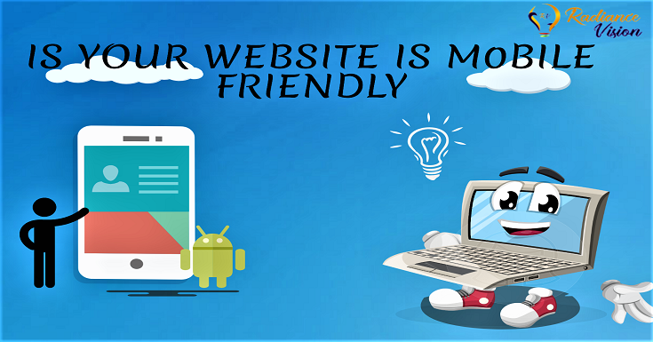
4. Mobile friendliness: Once a website for hand held devices are created, it is necessary to test them to check if they suitable to be offered to the public. One of the ways of testing it is to visit https://search.google.com/test/mobile-friendly , enter the URL of your website and run a test. It will reveal if your website is mobile friendly. It checks if your website is easy to use and if changes are to be made, it will be displayed.
5. Monotonous: An average human takes half a minute to determine if a website is worth exploring or not. For creating a positive user experience and to maintain the top rankings on Google, the website has to be updated with rich content and other attractive snippets frequently. Making your website unique will boost the rankings on Google.
6. Playable: Sometimes the content on the website might not support some soft-wares. For example, some content might require Flash player or some formats might not be supported on a mobile phone. In such cases thee experience in using a website will turn out to be negative. Once the website is developed, it is necessary to test it to check if all the elements in the website are working properly.
7. Compatibility: Studies suggest that Chrome, Safari, UC Browser and Opera are some of the most used mobile browsers. As a website creator you have to ensure that your website works in all browsers. In such cases, cloud based testing can be done across all major browsers.
8. Feedback: It is advisable to include a feedback session to check if people are satisfied by using the website. However one must not panic after receiving negative feedback as it is just an opportunity to improve the website and deliver better content. In the end, you are creating the website for the people and not for yourself.
At Radiance Vision we cater to the needs and wants of our clients in a professional manner. Our services are managed by a well experienced team who are updated with the latest trends in the society, technology and in marketing